Android adaptive icons: why my launcher icon showed as a tiny tile in a circle
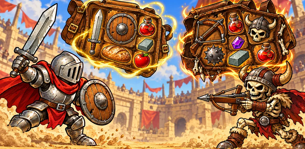
For eight releases, Backpack Battle's icon on the home screen was a small framed picture floating inside the launcher's circle, as if someone had put a postage stamp on a coin. The store icon looked fine. The launcher icon looked cheap.
How adaptive icons work
Since Android 8, launcher icons are adaptive: a background layer and a foreground layer, each 108×108 dp. The launcher masks them to its own shape (circle, squircle, rounded square) and may move them slightly for parallax. Only the centre 72×72 dp is guaranteed visible.
Android's adaptive icon XML already insets the foreground. Mine was set to 16.7%. So the right foreground is the full-bleed artwork, edge to edge, and the system shrinks it into the safe zone.
What I'd done was shrink it myself first, and frame it with a border, "to be safe". The system shrank it again. Result: a small, framed tile in the middle of a circle.
Worse, I'd earlier convinced myself that shrinking the foreground to 72% "helped". It didn't. I'd misread a different problem.
The label problem
Moonlit Garden had a related bug: its launcher label still said "Night Garden", the working name I'd changed precisely because it collides with a well-known children's TV brand. The build script never wrote the app's display name into Android's strings.xml, so the old name from the project template survived.
The checks
A script now checks every game before any icon or name release:
- the painted launcher foreground must be the full-bleed icon art,
- the foreground must have no transparent frame. The build refuses an alpha channel around the art,
- the launcher label (
app_nameinstrings.xml) must equal the app name incapacitor.config.ts.
And the step I'd skipped: look at the app drawer on an emulator after installing. Thirty seconds of looking would have caught both problems on day one.
A second script caught something more embarrassing: across most games, back, close and play buttons were text glyphs (an arrow character, a cross) inherited from the original engine. On some phones those characters render in a fallback font and look plainly low-effort. They're drawn SVG icons now, and the script fails on any glyph used as an icon.
Store art gets the same treatment
The Play Store has its own art, and its own checks:
- Feature graphics (1024×500) are made by script, with the title in each listing's language.
- Screenshots are taken by script from the real game, framed and captioned per language.
- A check fails any listing whose art is missing, or a byte-for-byte copy of the English art, unless it's declared deliberately shared (more on that).
Picking an icon
One practical tip from choosing Moonlit Garden's final icon: generate several options on one sheet and look at them at 48 pixels, the size they'll actually appear on a phone. Detail that looks great at 512 pixels turns to mush at 48. The winner (a glowing lotus on a golden pipe) was the one that still read clearly at that size.